The data acquisition process is one of the most important and initial steps of any data science pipeline. The data acquisition process for this project is as follows:
The following code snippet demonstrates the data retrieval process. The function game_id_generator() generates a list of game IDs for a given season. The class DataDownloader() is responsible for retrieving the data for a given game season and stores it in a JSON file.
def game_id_generator(year: int) -> [str]:
year = str(year)
total_games = (1230 if year == '2016' else 1271)
ids = []
# this is the regular season
for j in range(1, total_games+1):
ids.append(year+'02'+'{:04d}'.format(j))
# this is the playoffs
for i in range(1, 10):
for j in range(1, 10):
for k in range(1, 8):
ids.append(year+'030'+str(i)+str(j)+str(k))
return ids
The file data_downloader.py contains the class DataDownloader() which is responsible for retrieving the data for a given game season and stores it in a JSON file. The class contains the following key methods:
__init__(self, path: str|None, rewrite: bool = False,threaded:bool=True, worker:int=10, logger_path: str|None = None, log_level: int|None = logging.INFO): The constructor of the class. It takes path to the directory where the data will be stored, a boolean value indicating whether to rewrite the data if it already exists, a boolean value indicating whether to use multithreading, the number of threads to use, the path to the logger file, and the log level. The default values are set to None, False, True, 10, None, and logging.INFO respectively.download(self, year: int) -> None: This method is responsible for downloading the data for a given year. It takes the year as an argument and returns None.A major feature of the Downloader class is that it can be used to download the data in parallel. This is achieved by using the threading module.
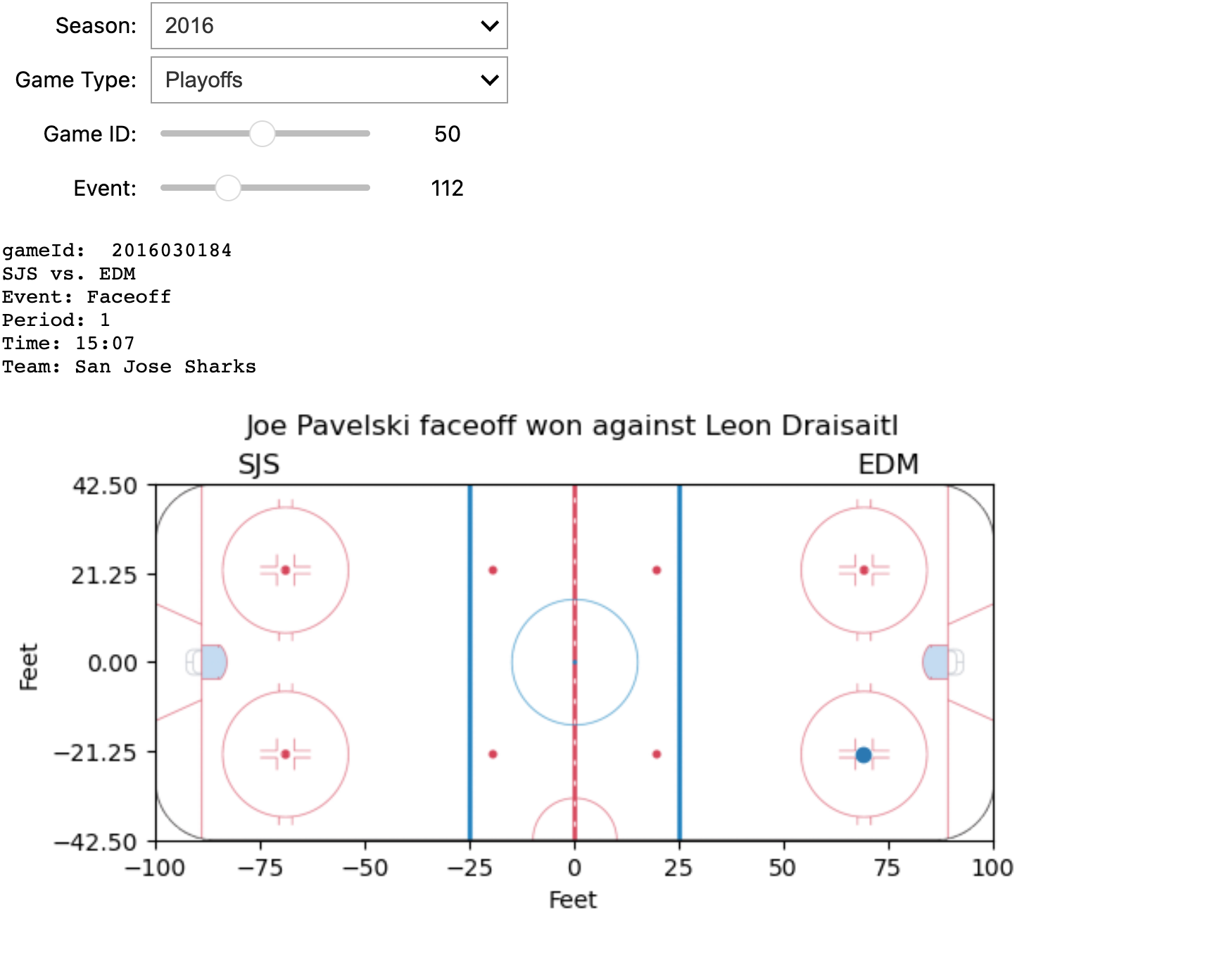
The screenshot displays some information about a specific game and an event within it, all of which can be dynamically configured using four interactive widgets. Below is the implementation of the tool.
files = getFiles(f'201602')
data = read_data(files[0])
# Initialize widgets
seasons = widgets.Dropdown(
options=['2016', '2017', '2018', '2019', '2020'], description='Season:')
game_type = widgets.Dropdown(
options=['Regular', 'Playoffs'], description='Game Type:')
game_id_slider = widgets.IntSlider(
min=1, max=len(files), step=1, description='Game ID:')
event_slider = widgets.IntSlider(min=1, max=len(
data['liveData']['plays']['allPlays']), step=1, description='Event:')
def update_game_id_slider(*args):
global files
global data
files = getFiles(f'{seasons.value}{game_type_digits[game_type.value]}')
game_id_slider.value = 1
game_id_slider.max = len(files)
update_event_slider()
def update_event_slider(*args):
global data
global files
data = read_data(files[game_id_slider.value-1])
event_count = len(data['liveData']['plays']['allPlays'])
if(event_count):
event_slider.max = event_count
event_slider.value = 1
event_slider.min = 1
else:
event_slider.value = 0
event_slider.min = 0
event_slider.max = event_count
def update_event_plot(season, game_type, game_id, event_index):
events = data['liveData']['plays']['allPlays']
if (not events):
print('No event')
return
print("gameId: ", data['gamePk'])
home = data['liveData']['linescore']['teams']['home']['team']['abbreviation']
away = data['liveData']['linescore']['teams']['away']['team']['abbreviation']
print(f'{home} vs. {away}')
event_data = events[event_index-1]
coordinates = event_data['coordinates']
if (not coordinates):
return print(json.dumps(event_data, indent=4))
period = event_data['about']['period']
t = [i for i in data['liveData']['linescore']
['periods'] if i['num'] == period]
if (t):
isHomeOnRight = 1 if t[0]['home']['rinkSide'] == 'right' else -1
summary = f"Event: {event_data['result']['event']}\nPeriod: {event_data['about']['period']}\nTime: {event_data['about']['periodTime']}\nTeam: {event_data['team']['name']}"
print(summary)
plt.title(event_data['result']['description'], y=1.1)
plt.imshow(rink_image_np, extent=[-100, 100, -42.5, 42.5])
plt.ylim(-42.5, 42.5)
plt.xlim(-100, 100)
plt.xticks([-100.0, -75.0, -50.0, -25.0, 0.0, 25.0, 50.0, 75.0, 100.0])
plt.yticks([-42.5, -21.25, 0, 21.25, 42.5])
plt.scatter(coordinates['x'], coordinates['y'])
plt.text(isHomeOnRight*(-75), 47, away, ha='center',
va='center', fontsize=12)
plt.text(isHomeOnRight*(75), 47, home, ha='center',
va='center', fontsize=12)
plt.xlabel("Feet")
plt.ylabel("Feet")
plt.show()
seasons.observe(update_game_id_slider, 'value')
game_type.observe(update_game_id_slider, 'value')
game_id_slider.observe(update_event_slider, 'value')
# Create interactive plot
interactive_plot = interactive(
update_event_plot, season=seasons, game_type=game_type, game_id=game_id_slider, event_index=event_slider)
output = interactive_plot.children[-1]
output.layout.height = '450px'
display(interactive_plot)
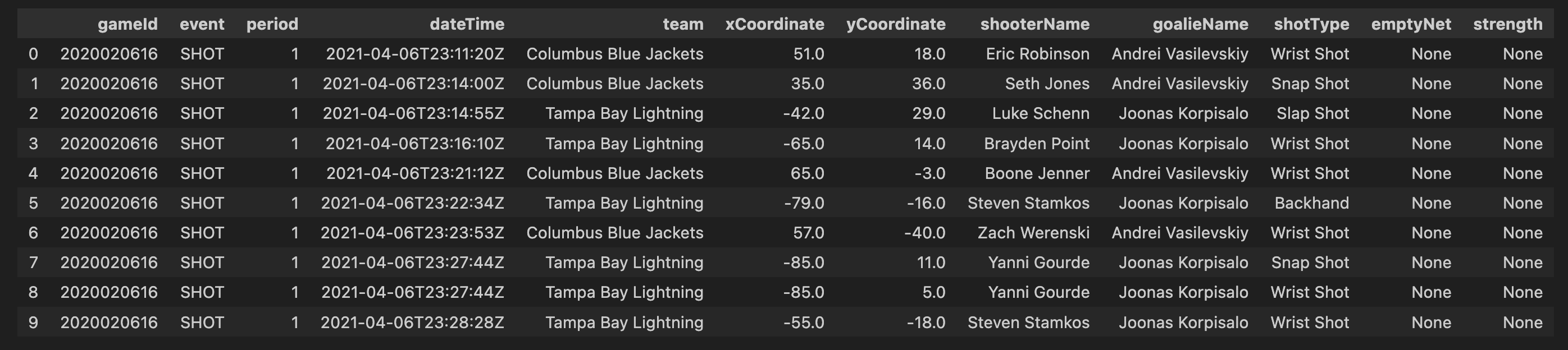
First 10 rows of tidied dataframe:
Assuming penalty events are provided with a start time (X), duration (T), and the penalized team (A), any events occurring within the time frame (X + T) will see team (A) with a reduced player count by at least one, compared to the last event before time (X). This principle also applies to the opposing team. We will maintain a record of the number of players on each team from the start of the game (typically 5-5) until its conclusion. Consequently, we can deduce the on-ice strength during shots and goals within the time frame (X + T) based on the team executing the event.
Real-time performance analysis enables a detailed examination of both team and player behaviors during a game. I will incorporate three metrics for each team, calculated from the start of the game up to each event:
df['season'] = df.gameId.apply(lambda x: str(x)[0:4])
In order to visualise only the seasons we are interested in, we first filter out all other seasons. In this code, you are essentially creating a new column, ‘season’, in your DataFrame df. The values in this column are derived from the ‘gameId’ column by extracting the first four characters, assuming that these characters represent the season information. For example, if a ‘gameId’ is ‘2017020235’, the corresponding ‘season’ value would be ‘2017’. This operation allows you to easily categorize and analyze your data based on seasons, providing a valuable additional dimension for your analysis.
So having done that we just wanna know the distribution of shots and goals in season 2017 just to have a general overview of the graph. We plotted bar graph so that it explains count of all type of events in a more easy way to convey the distribution of shot types across teams in the specified season, enabling your audience to quickly grasp and understand the key insights from the data.
plt.figure(figsize=(11, 7))
bars = plt.bar(shot_type_for_1_season.index, shot_type_for_1_season.values, color='blue')
for bar in bars:
yval = bar.get_height()
plt.text(bar.get_x() + bar.get_width()/2, yval, round(yval, 2), ha='center', va='bottom')
plt.xlabel('Shot Types')
plt.ylabel('Count')
plt.title('Distribution of Shot Types across Teams in season 2017-2018')
plt.show()
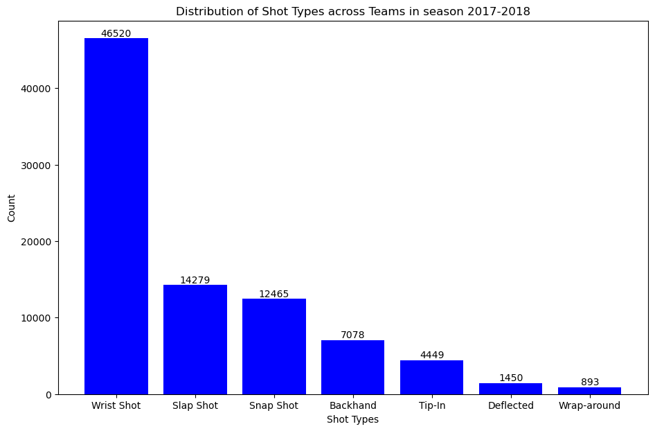
As seen in the graph, the most common type of shot is the “wrist shot” which has a count value of 46,520.
The next step is to analyzing and visualizing these counts could provide a comprehensive overview of team performance in terms of shot selection and goal-scoring proficiency. In our analysis, where we’ll explore visual representations and delve deeper into the significance of these shot and goal distributions.
shot_counts = filtered_df[filtered_df['event'] == 'SHOT']['shotType'].value_counts()
goal_counts = filtered_df[filtered_df['event'] == 'GOAL']['shotType'].value_counts()
plt.figure(figsize=(11, 7))
bars1 = plt.bar(shot_counts.index, shot_counts.values, color='orange')
for bar in bars1:
yval = bar.get_height()
plt.text(bar.get_x() + bar.get_width()/2, yval, round(yval, 2), ha='center', va='bottom')
plt.xlabel('Shot Types')
plt.ylabel('Count')
plt.title('Distribution of missed Shots in season 2017-2018')
plt.show()
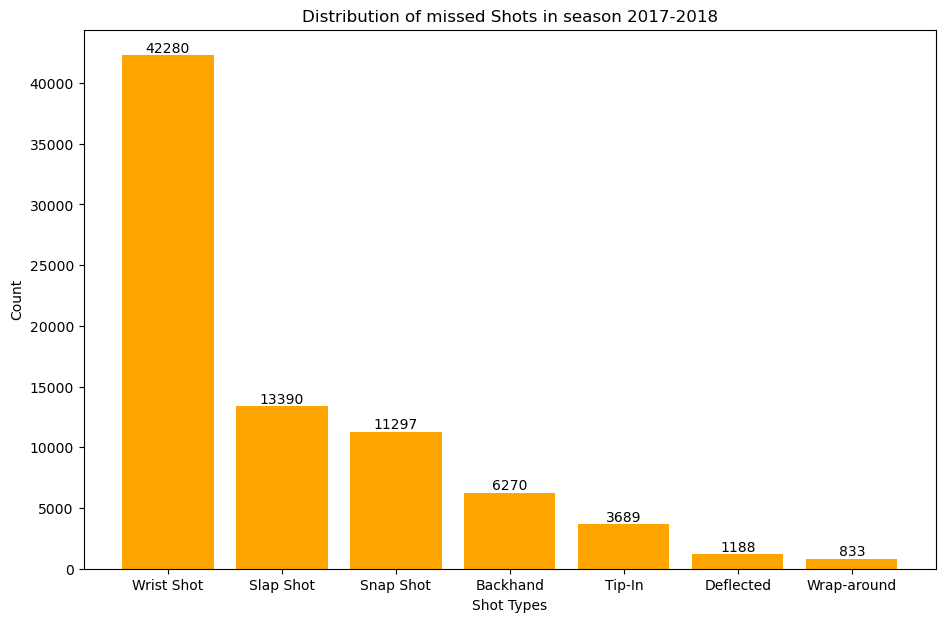
This plot gives us the distribution of missed shots accross all the teams in season 2017-2018
plt.figure(figsize=(11, 7))
bars2 = plt.bar(goal_counts.index, goal_counts.values, color='green')
for bar in bars2:
yval = bar.get_height()
plt.text(bar.get_x() + bar.get_width()/2, yval, round(yval, 2), ha='center', va='bottom')
plt.xlabel('Shot Types')
plt.ylabel('Count')
plt.title('Distribution of goals scored in season 2017-2018')
plt.show()
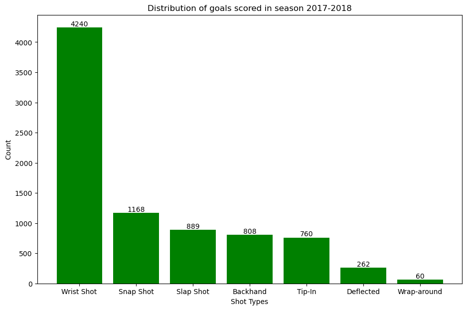
This plot gives us the distribution of goals scored accross all the teams in season 2017-2018
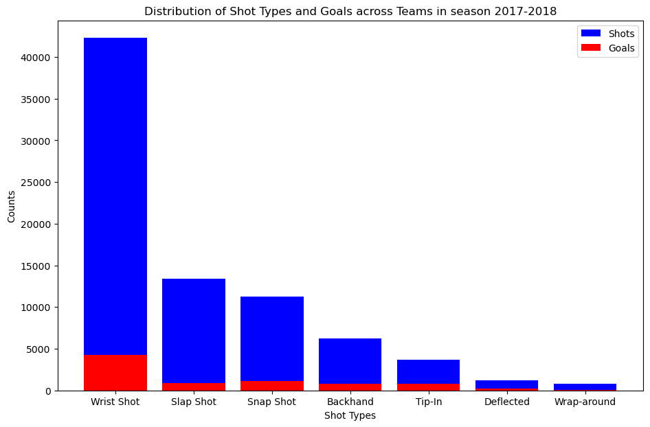
We overlay the number of goals scored on top of number of shots missed.
plt.figure(figsize=(11, 7))
bars1 = plt.bar(shot_counts.index, shot_counts.values, color='blue', label='Shots')
bars2 = plt.bar(goal_counts.index, goal_counts.values, color='red', label='Goals')
plt.xlabel("Shot Types")
plt.ylabel("Counts")
plt.title("Distribution of Shot Types and Goals across Teams in season 2017-2018")
plt.legend()
plt.show()
 To answer which type of shot is the most dangerous we use goals to shot ratio.
goal_to_shot_ratio = goal_counts / shot_counts
plt.figure(figsize=(11, 7))
sorted_goal_to_shot_ratio = goal_to_shot_ratio.sort_values(ascending=False)
plt.bar(sorted_goal_to_shot_ratio.index, sorted_goal_to_shot_ratio.values, color='purple')
plt.xlabel('Shot Types')
plt.ylabel('Goal-to-Shot Ratio')
plt.title('Goal-to-Shot Ratio for Each Shot Type in season 2017-2018')
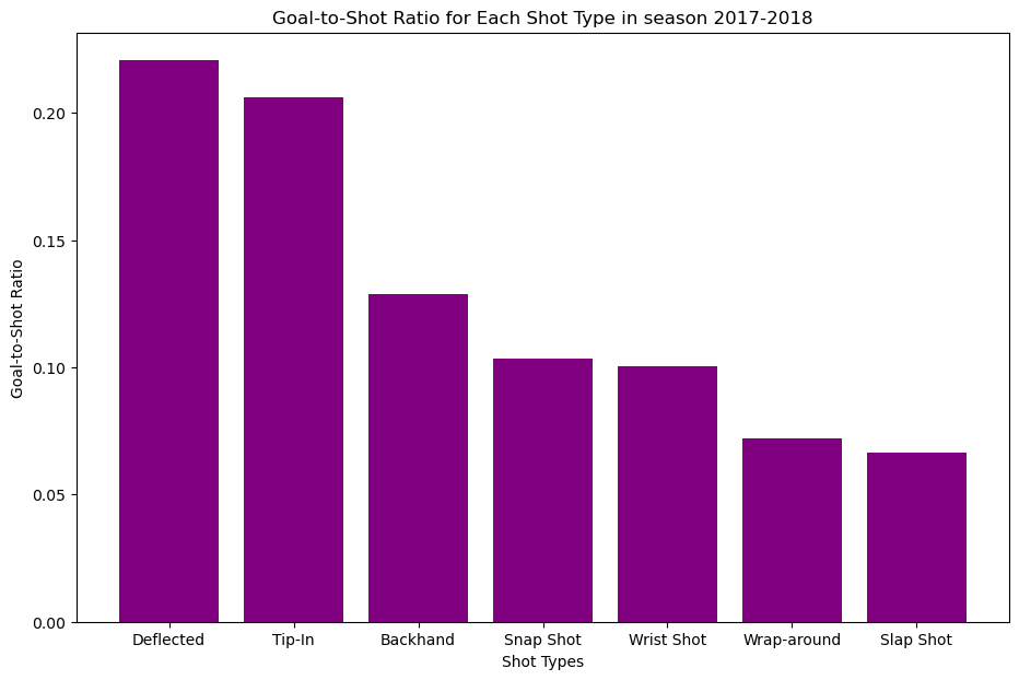 As shown in the bar graph the most dangerous type of shot is the “Deflected” shot type.
This snippit of code displays the filtering, processing, and binning shot data.
def filter_by_season(df, season):
return df[df['season'] == season]
df_18_19 = filter_by_season(df, 2018)
df_19_20 = filter_by_season(df, 2019)
df_20_21 = filter_by_season(df, 2020)
def abs(df):
df["x_values"] = df["xCoordinate"].abs()
return df
df_18_19 = filter_by_season(df, 2018)
df_18_19_processed = abs(df_18_19)
df_19_20 = filter_by_season(df, 2019)
df_19_20_processed = abs(df_19_20)
df_20_21 = filter_by_season(df, 2020)
df_20_21_processed = abs(df_20_21)
def process_season_df(df, x, y):
df["x_values"] = df["xCoordinate"].abs()
df["Distance_from_shot_to_goal"] = ((df['x_values'] - x)**2 + (df['yCoordinate'] - y)**2)**0.5
return df
x, y = 89, 0
df_18_19 = filter_by_season(df, 2018)
df_18_19_processed = process_season_df(df_18_19, x, y)
df_19_20 = filter_by_season(df, 2019)
df_19_20_processed = process_season_df(df_19_20, x, y)
df_20_21 = filter_by_season(df, 2020)
df_20_21_processed = process_season_df(df_20_21, x, y)
def process_distance_bins(df, distance_bins, column_name):
df["distance_bin"] = pd.cut(df[column_name], bins=distance_bins)
return df
distance_bins = np.arange(0, 110, 10)
df_18_19_processed = process_season_df(df_18_19, x, y)
df_18_19_processed = process_distance_bins(df_18_19_processed, distance_bins, "Distance_from_shot_to_goal")
df_19_20_processed = process_season_df(df_19_20, x, y)
df_19_20_processed = process_distance_bins(df_19_20_processed, distance_bins, "Distance_from_shot_to_goal")
df_20_21_processed = process_season_df(df_20_21, x, y)
df_20_21_processed = process_distance_bins(df_20_21_processed, distance_bins, "Distance_from_shot_to_goal")
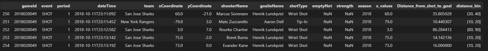
To kick things off, we begin by filtering our dataset based on seasons. The filter_by_season function allows us to segment the data into three distinct seasons: 2018-2019, 2019-2020, and 2020-2021. Next, we explore the absolute values of the x-coordinates of shots. The abs function is applied to each season’s DataFrame, creating a new column named “x_values” representing the absolute x-coordinate. Taking our analysis a step further, we calculate the distance from each shot to the goal using the Euclidean distance formula. The process_season_df function enriches our DataFrame with a new column, “Distance_from_shot_to_goal.” To facilitate a comprehensive analysis, we categorize the distances into bins. The process_distance_bins function bins the distances into 10-yard intervals, creating a new column named “distance_bin.”
Our processed dataframe would look like this.
At the heart of our analysis is the calculate_percentage_goals function.
def calculate_percentage_goals(df, event_type, group_column):
shots = df[df['event'] == 'SHOT'].groupby([group_column]).size()
goals = df[df['event'] == 'GOAL'].groupby([group_column]).size()
percentage_goals = (goals / shots) * 100
return percentage_goals
percentage_goal_20_21 = calculate_percentage_goals(df_20_21_processed, 'GOAL', 'distance_bin')
We start by isolating shot and goal events from our processed DataFrame (df_20_21_processed). The code filters the DataFrame to include only ‘SHOT’ and ‘GOAL’ events. The data is grouped based on the specified group_column, which in this case is ‘distance_bin.’ This groups shots and goals into bins representing different shot distances. We calculate the percentage of goals for each distance bin by dividing the number of goals by the number of shots and multiplying by 100. Now, let’s apply this function to our processed data for the 2020-2021 season and analyze goal percentages based on shot distances. All these steps are done for the dataframe df_18_19_processed and df_19_20_processed.
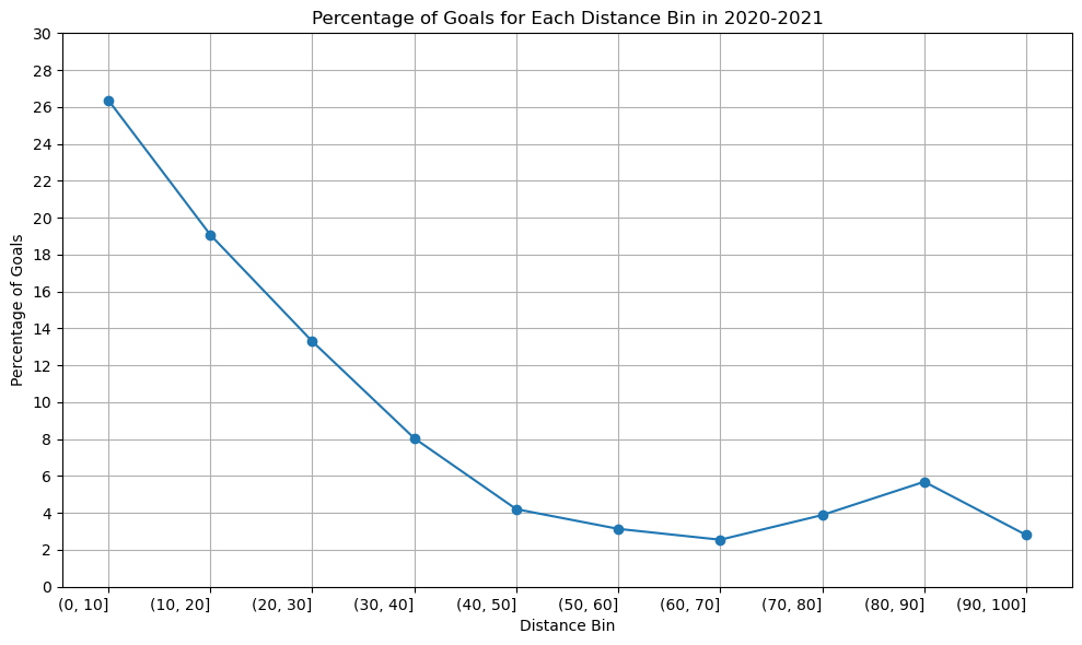
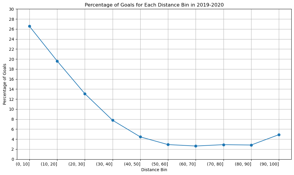
We plot the graph for all the season of 2020-2021, 2019-2020, 2018-2019.
Season 2020-2021
distance_bins = ['(0, 10]', '(10, 20]', '(20, 30]', '(30, 40]', '(40, 50]', '(50, 60]', '(60, 70]', '(70, 80]', '(80, 90]', '(90, 100]']
percentage_goal_values = [26.375148, 19.075207, 13.296433, 8.048613, 4.205128, 3.136553, 2.548387, 3.886398, 5.689900, 2.803738]
plt.figure(figsize=(10, 6))
plt.plot(distance_bins, percentage_goal_values, marker='o', linestyle='-')
plt.xlabel('Distance Bin')
plt.ylabel('Percentage of Goals')
plt.title('Percentage of Goals for Each Distance Bin in 2020-2021')
plt.xticks(rotation=0, ha='right')
plt.yticks([0, 2, 4, 6, 8, 10, 12, 14, 16, 18, 20, 22, 24, 26, 28, 30])
plt.tight_layout()
plt.grid()
plt.show()
Season 2019-2020
distance_bins = ['(0, 10]', '(10, 20]', '(20, 30]', '(30, 40]', '(40, 50]', '(50, 60]', '(60, 70]', '(70, 80]', '(80, 90]', '(90, 100]']
percentage_goal_values = [26.555337, 19.617940, 13.077823, 7.778287, 4.458217, 2.917599, 2.635838, 2.902903, 2.832031, 4.899135]
plt.figure(figsize=(10, 6))
plt.plot(distance_bins, percentage_goal_values, marker='o', linestyle='-')
plt.xlabel('Distance Bin')
plt.ylabel('Percentage of Goals')
plt.title('Percentage of Goals for Each Distance Bin in 2019-2020')
plt.xticks(rotation=0, ha='right')
plt.yticks([0, 2, 4, 6, 8, 10, 12, 14, 16, 18, 20, 22, 24, 26, 28, 30])
plt.tight_layout()
plt.grid()
plt.show()
Season 2018-2019
distance_bins = ['(0, 10]', '(10, 20]', '(20, 30]', '(30, 40]', '(40, 50]', '(50, 60]', '(60, 70]', '(70, 80]', '(80, 90]', '(90, 100]']
percentage_goal_values = [23.519953, 19.180947, 13.433584, 7.922977, 4.520010, 3.333050, 2.677974, 3.288364, 3.245090, 4.597701]
plt.figure(figsize=(10, 6))
plt.plot(distance_bins, percentage_goal_values, marker='o', linestyle='-')
plt.xlabel('Distance Bin')
plt.ylabel('Percentage of Goals')
plt.title('Percentage of Goals for Each Distance Bin in 2018-2019')
plt.xticks(rotation=0, ha='right')
plt.yticks([0, 2, 4, 6, 8, 10, 12, 14, 16, 18, 20, 22, 24, 26, 28, 30])
plt.tight_layout()
plt.grid()
plt.show()
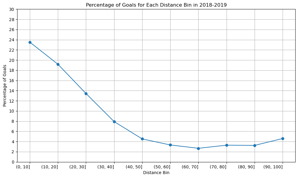
The graph’s structure is unchanged, as you can see, although the percentage of goals scored between [80-90] yards increased somewhat in the 2020–2021 season compared to the previous two. Since we have information about the three seasons, there won’t be any appreciable variations in the relationship between shot distance and shot taken. Since play styles may change over time and rules and developments may have an impact on the relationship between the distance and the type of shot taken, perhaps there would be a significant difference if we had more than 50 years.
A line graph is an excellent choice when dealing with data that has a sense of continuity or order, such as distance bins. In our case, the distance bins form a sequential and ordered set. The primary objective is to showcase trends in goal percentages as distances increase. A line graph, with distance bins on the x-axis and corresponding goal percentages on the y-axis, naturally emphasizes trends and patterns. The line connecting data points visually signifies the connection and progression from one distance bin to the next. This is essential for highlighting any smooth transitions or abrupt changes in goal percentages. In conclusion, the choice of a line graph is justified by its ability to effectively convey trends and variations in goal percentages across different shot distances.
shot_counts = df_18_19[df_18_19['event'] == 'SHOT'].groupby(['distance_bin', "shotType"]).size().unstack(fill_value = 0)
goal_counts = df_18_19[df_18_19['event'] == 'GOAL'].groupby(['distance_bin', 'shotType']).size().unstack(fill_value = 0)
percentage_goals = ((goal_counts / shot_counts) * 100).fillna(0)
The heart of our analysis lies in two key variables: shot_counts and goal_counts. Let’s delve into the code to understand how these metrics are derived. We begin by isolating shot and goal events from our 2018-2019 season DataFrame (df_18_19). The groupby function is then used to group data by both ‘distance_bin’ and ‘shotType.’ The size function counts the occurrences of each combination of ‘distance_bin’ and ‘shotType,’ resulting in a DataFrame where rows represent distance bins, columns represent shot types, and each cell represents the count of shots or goals. The unstack function is applied to reshape the grouped data, making it more readable. The resulting DataFrame, shot_counts and goal_counts, has distance bins as rows, shot types as columns, and counts as cell values. The percentage of goals is calculated by dividing the ‘goal_counts’ by ‘shot_counts’ and multiplying by 100. This operation results in a DataFrame where each cell represents the percentage of goals for a specific shot type and distance bin.
The dataframe would look like this.
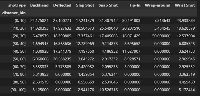
Using this information we plot the heatmap for the season 2018-2019.
plt.figure(figsize=(16, 8))
heatmap = sns.heatmap(percentage_goals.T, annot = True, fmt=".1f", linewidth=.5, cmap = "crest", vmin=0, vmax=100, cbar_kws={'label': 'Percentage of Goals'})
plt.xlabel('Distance from the goal post')
plt.ylabel('Shot Types')
plt.title('season: 2018-2019')
new_tick_labels = ['{}-{}'.format(b.left, b.right) for b in percentage_goals.index.categories]
heatmap.set_xticklabels(new_tick_labels, rotation=0)
plt.show()
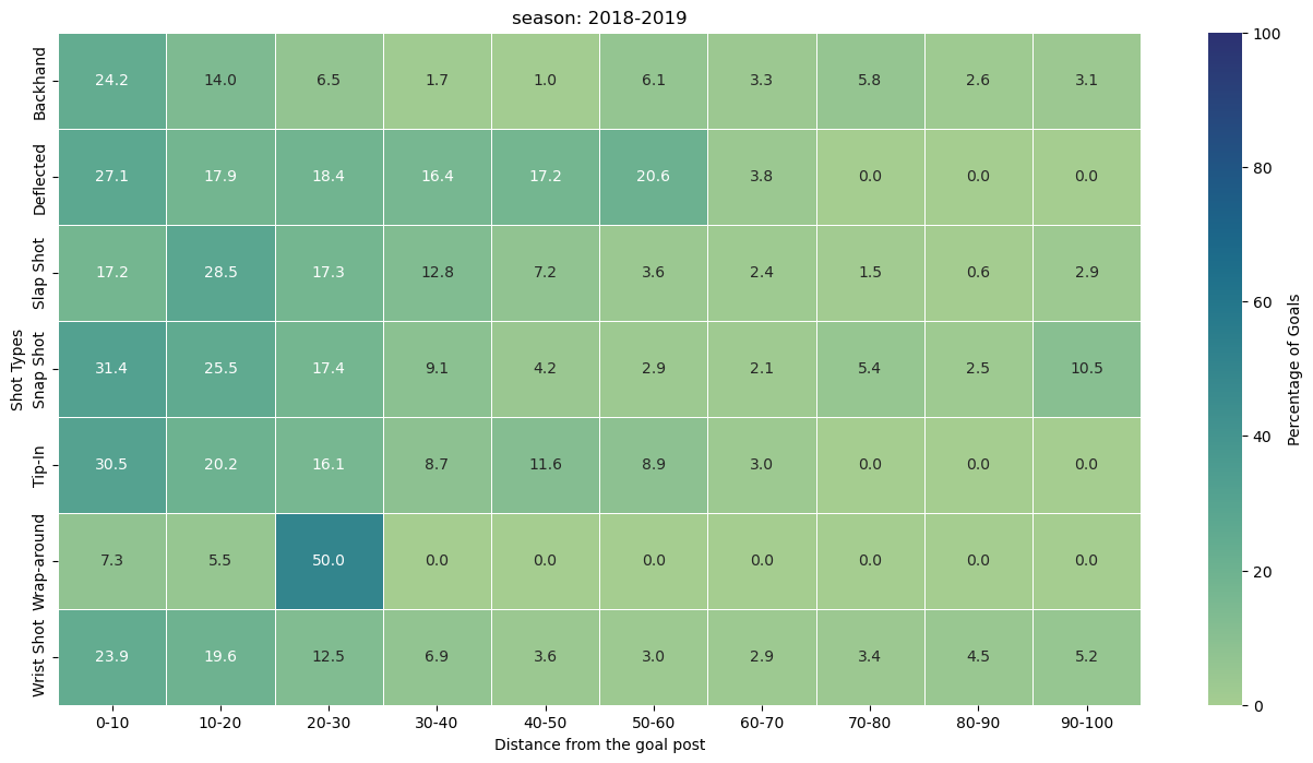
Observation from the heatmap.
(0, 10] Distance Bin: Snap Shots (31.41%): Snap shots dominate in this close-range distance bin, showcasing their effectiveness in quick, close-quarter situations.
(10, 20] Distance Bin: Slap Shots (28.50%): Slap shots take the lead at a slightly greater distance, suggesting their potency in mid-range scenarios. Snap Shots (25.55%): Snap shots continue to maintain a high success rate in this range.
(20, 30] Distance Bin: Wrap-around (50.00%): Wrap-around shots emerge as highly effective in the mid-range, indicating their success in situations closer to the goal.
(30, 40] Distance Bin: Deflected (16.36%): Deflected shots showcase reasonable success in this distance bin, providing a tactical option for goal-scoring opportunities.
(40, 50] Distance Bin: Deflected (17.24%): Deflected shots maintain effectiveness, suggesting their utility even at greater distances. Backhand (11.63%): Backhand shots also demonstrate noteworthy success.
(50, 60] Distance Bin: Deflected (20.59%): Deflected shots continue to be a formidable option. Backhand (8.93%): Backhand shots maintain their presence as a strategic choice.
(60, 70] Distance Bin: Deflected (3.77%): Deflected shots see a slight decrease in success. Backhand (3.33%): Backhand shots remain a viable, albeit less common, choice.
(70, 80] Distance Bin: Backhand (5.81%): Backhand shots regain prominence at this longer distance, suggesting their potential in varied scenarios.
(80, 90] Distance Bin: Backhand (4.46%): Backhand shots continue to exhibit a presence, albeit with a lower success rate.
(90, 100] Distance Bin: Snap Shots (10.53%): Surprisingly, snap shots regain prominence in the longest distance bin, showcasing their adaptability even at a distance from the goal.
This analysis provides helpful insights on the efficacy of various shots at various distances, even if the success of a shot type depends on a variety of factors, including player skill, defensive methods, and goalkeeper proficiency. This knowledge can be used by coaches and players to modify their tactics and emphasise the significance of selecting the appropriate shot type in particular game situations.